In Bloom Beta I observe a change to the ‘color chooser’ for text and styles. I would like to express my preference for what is currently in Bloom 5.3.6. There is a range of colour choices and each has a logical name but in 5.4 beta the colour choices are greatly reduced and they are labelled with (user-unfriendly) character strings. I hope these changes will not be maintained in the next release version.
James thanks so much for that feedback on the beta. We only have a few weeks left, so you just made it! I think we can fix the display of color values. For reference, here’s what we’re talking about
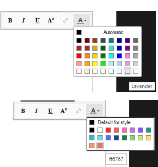
What we’ve had up until now is just what came with the software component we use, by default. In 5.4 we actually stopped and thought about the palette, but we may not have gotten it right. So I would like to hear more thoughts. Is the right-side column of greys actually useful? Are the off-white colors on the bottom row? I’m not picturing how these would actually be used for text in Bloom-style books. How about the three oranges that look the same on my screen? 5.4 has removed these, and added a simple set of warm colors. We could expand this in any direction that is helpful.
One thing that might help, could you share any screenshots where you are using colored words? I would especially like to see how the greys and the light colors can be used in real books.
thanks!
John
One more thing that could be relevant. In 5.4, you can set the color of the whole box, via the style format box:

In this tool, you can add your own custom colors. The palette you create in this way shows up everywhere we offer colors: in text boxes, selected characters (as above), text in overlays (comics), and book covers. The palette is shared across the books in a collection.
My only use of coloured text was in a recent workshop compiling story books of differing reading levels. We listed the reading level on the cover (in place of the English translation of the title) using a different colour of text for each level. The books haven’t been printed yet so I don’t know how well this will work out.

I do like the idea of being able to choose custom colours and that would compensate for a more limited default palette (as in Bloom Beta). Some of the existing options do look very similar and I doubt any of the greys or off whites would be useful. So I think the screenshot in your second post is good. But perhaps more creative people have other ideas?