The Embera Tadó language has frequent use of aspirated consonants, which requires a tick after those consonants. This can be produced using the Andika font, but the spacing is not great (too much space before the ’ , or tick). Therefore we use the kerning function in LibreOffice to reduce that space between the consonant and the tick. That is a simple tool in LibreOffice, just like adjusting the leading. Would it be possible to include kerning in BLOOM character settings? I see that the kerning adjustments I make in LibreOffice are not replicated if I copy and paste into BLOOM.
@Penelope_Pickens
Thank you for the suggestion.
While I don’t think we can afford to add a character kerning feature to Bloom, we should be able to help you using font features. We just need to figure out what the custom css should be and put it in your collection.
I’ve put a question out to our colleagues who are experts in this area to determine how to best create the custom css.
I’ll let you know when they respond.
Andrew
Hi Penelope - Bloom is not going to be able to help you get the ‘kerning’ from LibreOffice into Bloom. That’s because the manual ‘kerning’ in LibreOffice is an app-specific feature that will only work in LO. You can’t take text from LO and copy it anywhere else and expect that manual ‘kerning’ to copy over.
A way you could replicate the same spacing in Bloom would be for Bloom to create a new feature that allows users to create custom kerning. That might require a lot of resources that the Bloom team doesn’t have. Even then you’d need to reset that kerning by hand - it wouldn’t carry over from LO.
The only way to get the spacing you want to be consistent between LO and Bloom (and other apps) would be for us (the WSTech team who produces Andika) to reduce the space in the font itself - either through changing the width of the ‘tick’ (aka apostrophe or single quote) or adding kerning for your specific combinations. However that would have the effect of reducing the space before the apos/quote for everyone else in the world, too!
We are looking into adding more kerning into the next versions of our Latin-script fonts, but I can’t guarantee that we could make it look how you ideally want it to look. But if you could please let me know what specific character combinations you feel needs kerning then I can add those to our list of kerning requests.
If you were to use the preferred U+02BC (modifier apostrophe) instead of U+2019 (single quote punctuation), you would get a little less space between the consonant and the “tick”. This is true at least for Andika, I cannot guarantee other fonts would be the same.
Hello Victor - I understand totally. I thought I would just throw it out there as a language specific need we have.
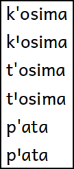
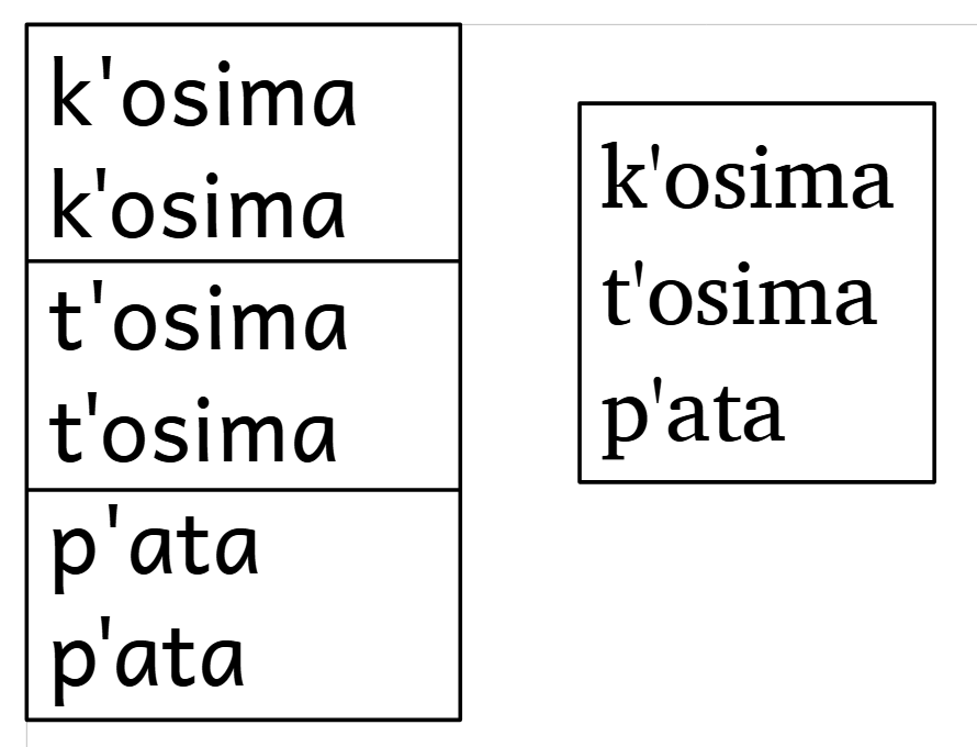
I like to use the Andika font because it is excellent for literacy materials. The problem does not exist, though, using Charis SIL. The three consonants with aspiration in the language which require the apostrophe in combination with the consonant are p, t and k. Below you can see an example of words using Andika, first without kerning, then with kerning. To the right is how they appear using Charis SIL, and there was no need to adjust the kerning.
Lorna suggested using U+02BC (modifier apostrophe), but I’m not sure that would be accepted by the people since we have been using this other option which is distinctive from an apostrophe. Font design is not an expertise of mine, but I do wonder why Charis SIL doesn’t have this problem but Andika does.
Thanks for your help and suggestions, Penelope
Thanks - that’s very helpful. Andika is more loosely spaced, and was designed with intentionally wider punctuation for new readers, which means extra space when you stick U+2019 between two letters. The purpose is to keep more space between punct+letter than between two letters:
But when you use it as a letter, and expect it to have letter-like spacing this is annoying. That space is then exaggerated when those are two lowercase round letters like p and a.
Charis is more tightly spaced in general and is meant for publishing, with tighter punctuation overall, and less concern for keeping words and punctuation distinct.
I’ll consider whether we can trim a bit of space off U+2019 and related characters, but that may not be as much as you would like. We’re also looking at adding kerning in the next major version due in a few months, which could help tighten things up when the tick is followed by a round letter. IOW we can make this tighter but probably not as much as you’d like, as it remains a very common punctuation character.
There is a different “wordforming character” that is straight like 2019 but a bit bigger: A78C “Saltillo”. The spacing looks the same, but since A78C is wider and longer than 2019 I think it looks more like a “letter” than 2019 does. But actually, I have thought for a while that A78C could be kerned closer to the following character. Here are the words from your example (screenshot from LO, no kerning):