We need these diacritics stacking (ầ, ề, ồ, î̀, ộ̀, û̀) in order to show differences in pronunciation in a dictionary (ongoing). The second diacritic (combining grave) sits well on the first three letters as required (see image), but doesn’t sit well on the last three letters. Any ideas on how to get the diacritics on the last three to sit as required? I would like things that behave the same way to look the same way.
I expect this is a font issue. What font are you using?
As @drowe indicated it is likely to be a font issue, the last three characters you list have a base character and combining diacritic, the base characters are:
î 00EE LATIN SMALL LETTER I WITH CIRCUMFLEX
ộ 1ED9 LATIN SMALL LETTER O WITH CIRCUMFLEX AND DOT BELOW
û 00FB LATIN SMALL LETTER U WITH CIRCUMFLEX
I assume that these three glyphs in the font do not have anchor points for the combining grave to attach to.
Your data is using Unicode Normalization Form C NFC, you may want to try changing a sample of your data to NFD to see if your font will render it correctly as NFD data instead.
Note that the first three characters are fully precomposed, so do not use a combining acute like the three later character sequences.
It is possible that the font has no support for combining diacritics, in which case you may have to select an alternative font.
If you look for another font, one issue you may encounter is the position of the acute on ầ, ề, ồ will reposition to the side of the circumflex rather than being centered above the circumflex, this is the norm for fonts that default to Vietnamese typographic preferences.
The problem may not be the actual font, it may be with the software you are using. It may not support complex rendering of Latin script, and might not be able to effectively render text using combining diacritics.
A quick test would be to use a the Gentium Plus font with a sample, if Gentium Plus fails to render correctly, the problem is most likely with your software.
It looks like you are using U+0340 COMBINING GRAVE TONE MARK and not U+0300. The annotation for U+0340 and U+0341 says:
Vietnamese-specific accent placement should be handled
instead by specialized rendering of 0300 and 0301. Use of
0340 and 0341 is discouraged.
I think you will get better results from more fonts if you use U+0300 instead. I think our SIL fonts don’t even support U+0340 and U+0341 since their use is discouraged.
I don’t know why you are getting different results in the first 3 from the last 3. None of these render well for me.
Good catch Lorna, I overlooked it. In theory, for a font that correctly supports those characters the rendering should be:
But as Lorna indicated they are deprecated Vietnamese tone characters.
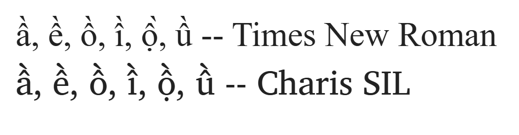
We’re using Charis SIL. We will like it to be the way it is in that book, so that we won’t have to explain and explain.
I’ve changed it to 0300 and 0301 but the results is the same. For Charis SIL, it stacks it one on the other.
Please what font is this?
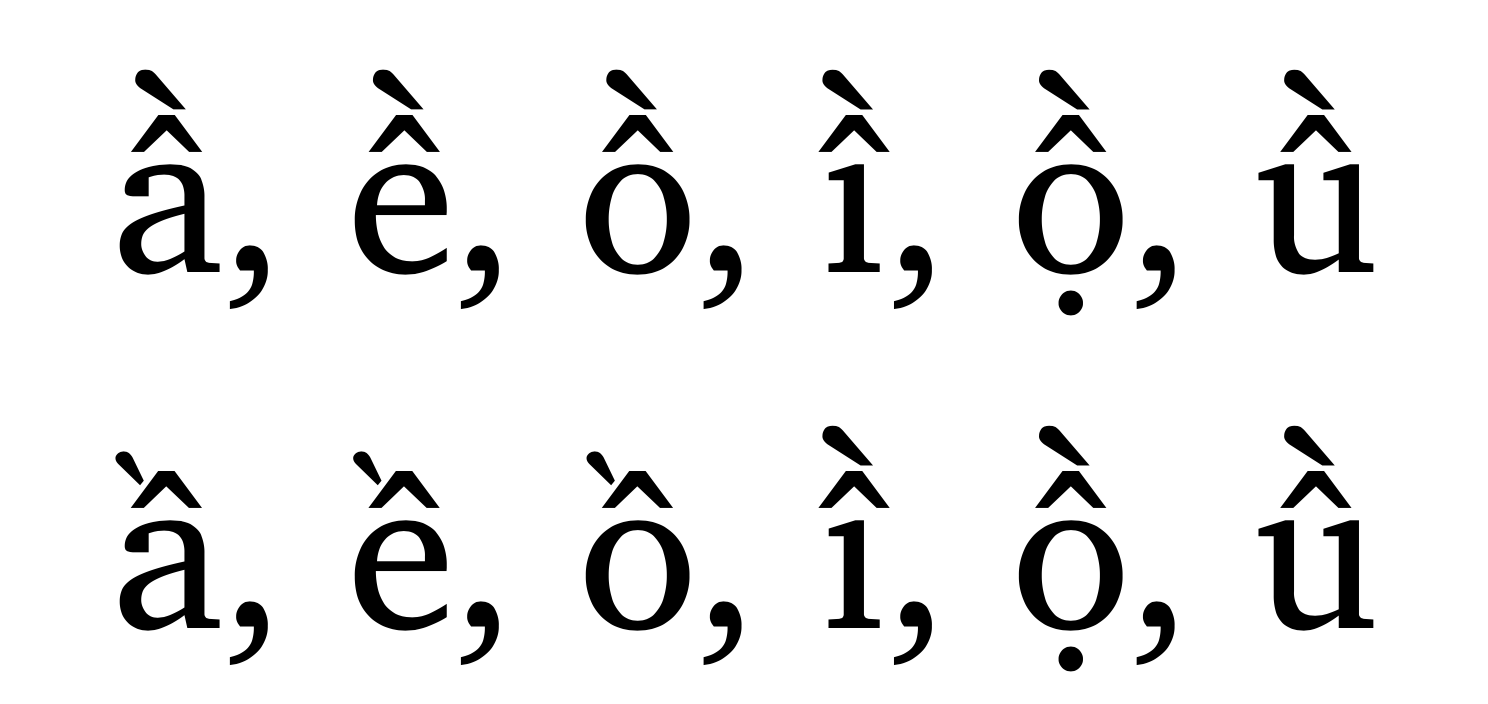
The following image is a screen shot from MS Word, on macOS. Both lines use Charis SIL. The first line is the default rendering for Charis SIL, all diacritics are positioned appropriately and are consistently displayed.
The second line is when the editing language is Vietnamese. The first three letters change their rendering based on Vietnamese typographic principles. The last three letters in this line are not letters in the Vietnamese repertoire, and do not have glyphs that use the Vietnamese rendering.
1 Like
This topic was automatically closed after 13 days. New replies are no longer allowed.