In thinking through the design of a new keyboard for a language that has labio-velars (kp, gb and ŋm) but also has the fricatives š and ž sounds (like in czech), written with sh and zh , I am thinking their “place” should rightly be with those on the front row seats. abcdef etc.
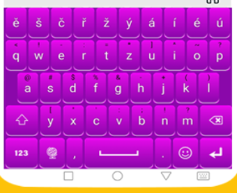
Looking at the keyboard of czech I see this:
Adding an extra line to the front row seats to give all these characters they place they should have. The š is not hidden under the s long-press etc. Using that as a general design principle, should we thus, in the case of languages in West-Africa at least, offer front-row seats to these digrahs? I see several advantages:
users who already intuitively know that gb, kp etc are just one sound, can now type it with one key,
reducing long-pressing and thus the ease of typing
raising language awareness “my langauge is different and deserves a seperate keyboard”, maybe even adding to a sens of pride?
Keyboards as currently designed only readily handle would states … lowercase characters on the normal layer and uppercase on the shift layer.
I have seen layouts that add digraphs to the shift and normal layers. But including digraphs requires handling three cases (lower, upper and title cases) when the digraph can be word initial.
It would need a fundamental rethink of how a keyboard would work esp a physical keyboard. It would be doable but may become anti-intuitive for end users.
I see what you mean Andrew. I was mostly thinking about on screen keyboards for Android and OIS, not so much for physical keyboards. I think there are and will be hundreds of thousands if not millions of people on this planet who will never use a physical keyboard but will use on-screen keyboards. I like the Czech philosophy in that they kept the qwerty part in tact and added a layer to the screen keyboard. So someone moving (later or earlier) to a physical keyboard can adapt quickly.
Casing is probably the biggest challenge here. You could have a tri-state shift; that is, have a ‘Title-Case’ as well as ‘UPPER CASE’ and ‘lower case’ layer:
sh -> SH -> Sh
A future update of Keyman is planning to add some casing functionality in where we can support ‘title case’ for start of sentence situations, with appropriate control from the keyboard designer. That may well make this model even more palatable.
As an optimisation for touch platforms, I don’t think it hinders the move between desktop and mobile much. Do remember though that large numbers of people use physical keyboards paired with touch devices, especially for large-scale data entry, where touch is simply not as efficient or accurate. But keeping that in mind, the model as shown with Czech doesn’t hinder that.
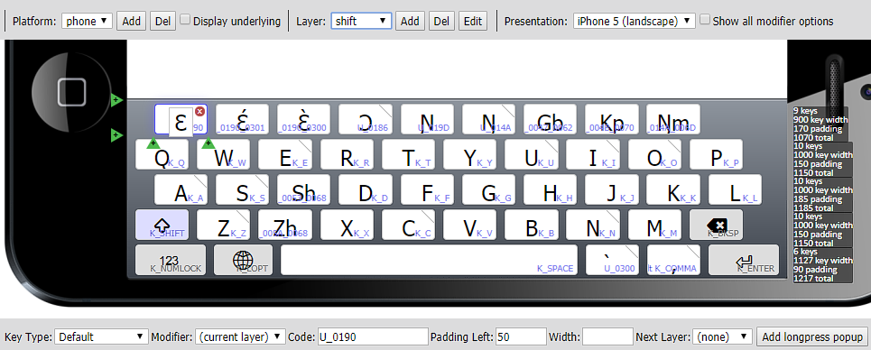
Thanks for adding to that Mark. I am afraid I do not grasp casing. Let me show you where we are at the moment, showing both layers (still a design / test phase)
So, sh is types in lower case (almost always) and Sh in upper case at the start of sentences or in proper nouns. Why would one need SH for a touch screen ? … only reason I can see is to SHOUT which I can confirm is a convention that is as yet unknown here. (Possibly, because one would not quickly shout to eachother in this very polite culture, at least not outside the family…) Going astray here
Let me add what guided us in this design. Sh and Zh are frequent and since there is space (10 max) for them by moving the Enter and quote key next to the space bar, we want to try and see what people think. Gb Kp and Ngm should ideally also be next to g and p etc, but that would mean 12 ro 13 in a row and since we started a new top row, there is room there. It also does not mess up the qwerty look and feel too much.
On the top row are vowels (at the moment with both high and low tones) that are THE most frequent in the language, surpassing all the other vowels in frequency by far. So we think they should have a front-row-seat with the others. The ɔ́ and ɔ̀ vowels are much less frequent, so they are on long-press under ɔ, same for the capitals.
One think I am not sure about is whether to provide both the complete character, say ɛ́ and a sequence possibility as well : ɛ + u_2019 From a design perspective, is redundancy a good thing ? Or would you advice to just provide one way of typing the ɛ́ ? Same for just the plain ɛ, we could add it as a long-press under e, as a second option ? I’d like your advice on this as well as any comments you would have regarding this keyboard.
The challenge with casing is how to implement language specific casing rules. And whether rules are language invariant and built into Keyman or language sensitive and built into keyman. Or tailorable somehow by keyboard author.
I assume there is locale specific casing in TypeScript but really only provides a solution for some languages.
For onscreen keyboards i tend to go a step further and have additional optimisations for a language usually available via long press
I tend to draw a distinction between tablet and phone layouts. Because of the larger screen size on a tablet, my tablet layouts are a hybrid partway between physical keyboard layout and phone layout. Sharing features of both, in terms of keys assigned to alphabetic characters.
When I have spare time, a very limited commodity at the moment, I was intending to pull apart a few keyboard layouts and document the design considerations and principles that went into it.
Back in the late 90s I had to create a Dinka keyboard for someone from the local Dinka community here in Australia. He was working on an eighty page translation for a Federal government department. He wasn’t very conversant with computers so I ended up typing his handwritten version then had him proof my typing.
The experience of typing long douments in a keyboard layout altered my thoughts and approaches to layout design.
Honestly some keyboard layouts are fine for short texts but when working with longer texts often it is best to optimise the experience.
The other factor is user and community expectations on how the layout should work when typing … but that involves a whole different anecdote involving a language that users wanted to type in three scripts (Latin, Ethiopic and Arabic) but wanted to use exactly the same key sequences to type equivalent text across the three scripts. A fun experience especially with Arabic script.
Currently your shift layer is technically Title case rather than uppercase
Unicode spec has a notion of three cases:
lower, e.g. kp
upper, e.g. KP
title, e.g. Kp
In reality is title casing is likely to be used more often than upper casing. But some people do use uppercasing, key issue is whether your intended user community want or need uppercasing.
With respect to vowel and diacritic combinations, I don’t tend to added keys for all the combinations. Generally it would add too many keys to the layout. For tablets I tend to have a bet each way. Add specific diacritic keys (same as a physical layout) and also add them to the vowel’s longpress. On phones they would be on longpress
For instance, long press on the “a” key has “ä” and “ää”
But I would stress that user community testing and feedback are desirable. I also try to write a keyboard design spec and get feedback from members of the prospective user community.

 which I can confirm is a convention that is as yet unknown here. (Possibly, because one would not quickly shout to eachother in this very polite culture, at least not outside the family…) Going astray here