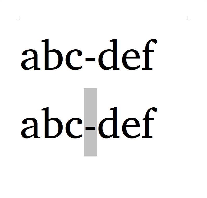
The hyphen-minus (U+002D) looks OK, but the non-breaking hyphen (U+2011) in italic and bold italic takes more width than it should, which makes it look like there is some space between it and the following character. Charis, Gentium and Gentium Book have this issue.
Thanks - definitely a bug! We’ll fix that in the next version.
Actually I can’t reproduce the problem. Can you tell me what app and operating system you are using, and what version of our fonts?
The fonts are all 6.101. I use the latest LibreOffice Writer on Windows 10 Home. The problem is also in PDFs created by LibreOffice.
Texts in MS Notepad and HTML files (in Firefox) look OK.
EDIT: OK, I’ve checked other fonts in LibreOffice, and the problem remains. I’m going to LO to file a bug there. Sorry for bothering.