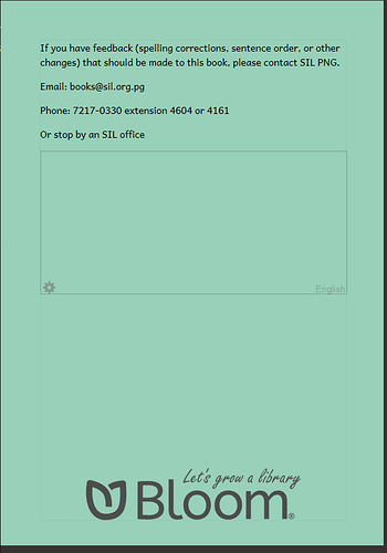
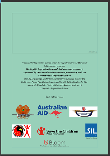
Bloom shows previews for how a cover will look after it’s printed on colored paper, but it gives a poor approximation. Here’s an easy way to improve them.
When the cover only has black ink, Bloom’s view looks great.
But once you introduce light colors, especially white, the preview gives a false impression. There’s no way to print white on a green paper. The darker color always wins.
To fix this, use CSS { blend-mode: multiply; } on the elements above the paper when creating previews. Multiply is the blend mode that best simulates printing. You can read more about it here.


