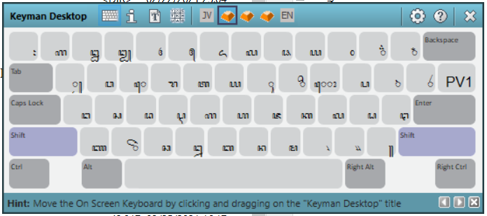
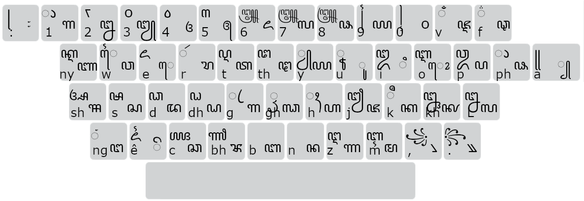
in on-screen layout, the character position is badly positioned, too much to the lower right, with a lot of space in upper right. In our new keyboard standard for Javanese Script, it’s imperative to show the full script, without any section cut, because there are many characters that’s different only in the lower section where it’s cut in the on-screen layout.
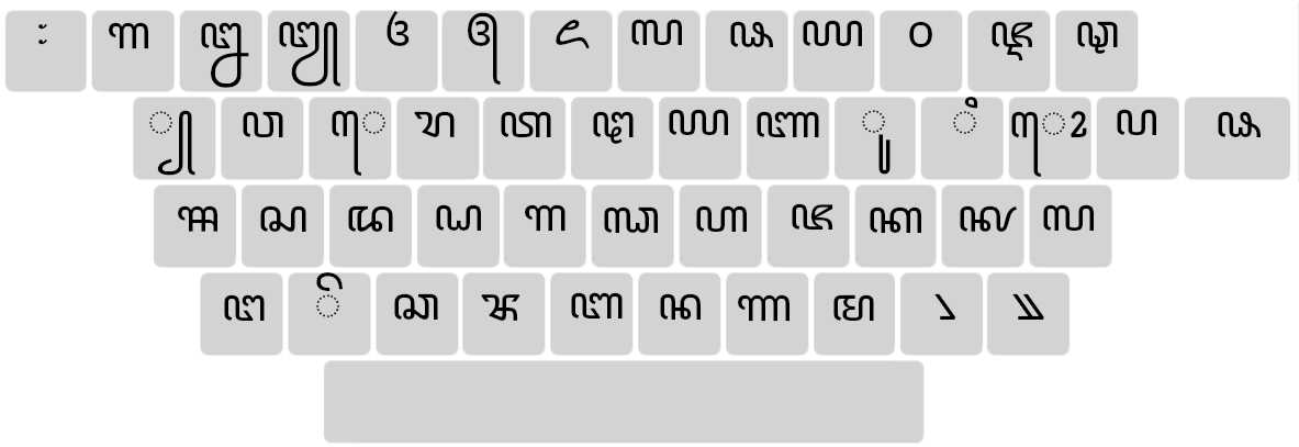
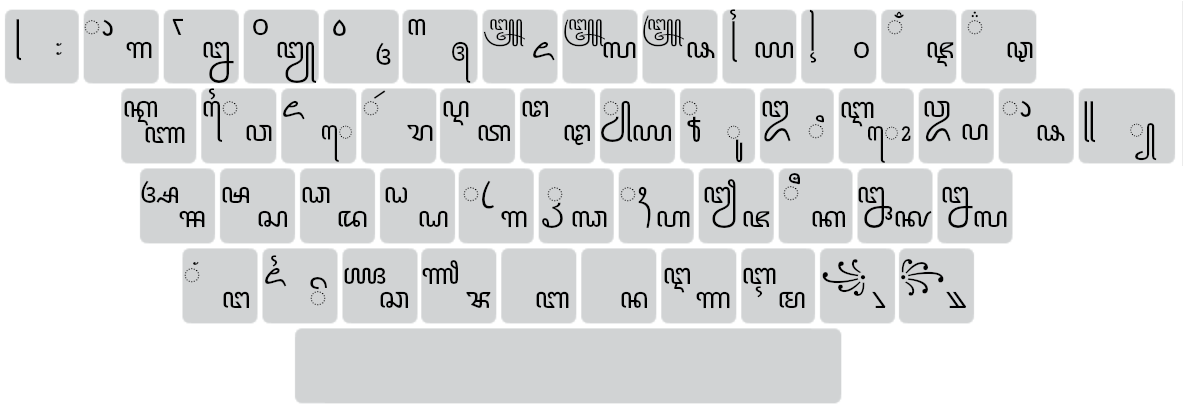
This is opposed to the touch layout, where they could be displayed centered vertically and horizontally, and shown in full character, as per our specification.
Trying to edit the first paragraph, always return “there was an error updating that topic”. i gave up.
in on-screen layout, the character position is badly positioned, too much to the lower right, with a lot of space in upper left. In our new keyboard standard for Javanese Script, it’s imperative to show the full script, without any section cut, because there are many characters that are different only in the lower section where they’re cut in the on-screen layout.
Note, the first 3 screenshot using Windows default font: Javanese Text. My mockups using Google’s NotoSans, but the new version (unofficially, we call it version 2)
Different fonts do have different line heights, therefore it’s best if the reposition could be done manually.
sorry if my question is silly. is that css for osk or mobile? i don’t want to reposition touch layout, but osk. would that affect both, just touch, or just osk? thanks.
Yes, currently the desktop OSK is a lot less customisable than I’d like. I don’t have any good solutions at present; we may try and move to a HTML-based solution in the future but that has its own challenges (particularly around security)