I think that Gentium Plus Italic at default sizes (16px/ 12pt) looks slightly smaller in Firefox and LibreOffice. See the screenshot below with two lines of Charis (which looks OK) and two lines of Gentium:
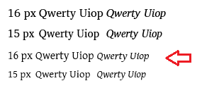
Actually it’s the 16px upright that is appears artificially tall. This is due to the improved hinting in v6 that makes the upright faces clearer and more readable. Unfortunately the same improvements do not apply to the italic, and at this exact ppem value the difference becomes noticeable. There’s little we can do to improve this without badly affecting other sizes.