I’ve noticed a few improvements that could be made to the Gentium Plus fonts. (The following screenshots are actually of Gentium Plus Compact, but that makes no difference for these purposes.)
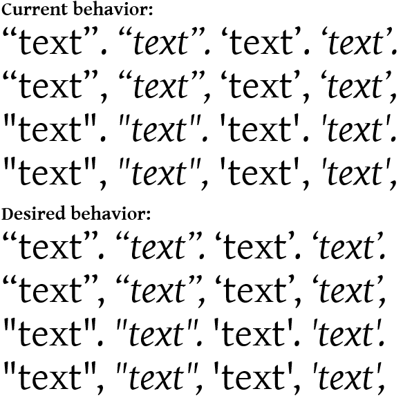
Issue 1:
The kerning between the double- and single-close-quote and the period and comma is very loose for those of us who use British/“logical” punctuation. The same also applies to straight quotes.
More-or-less, I think there should be little-to-no optical space between the close-quote (or straight quote) and the period or comma in the sequences ⟨”.⟩, ⟨’.⟩, ⟨”,⟩, and ⟨’,⟩; and ⟨".⟩, ⟨’.⟩, ⟨",⟩, and ⟨’,⟩.
NB: I only spent a few minutes fiddling with the spacing on the “desired behavior” examples, I’m sure they could be improved with some fine-tuning.
Hi David - Thanks for the feedback. I’ll make a note of it for future releases, although because of the number of fonts we maintain and the wide variety of languages we support we rarely have the time to adjust all but basic kerning. We’re still trying to get the Bold and Book Bold weights of Gentium released! We hope to have something to start testing in the autumn.
1 Like
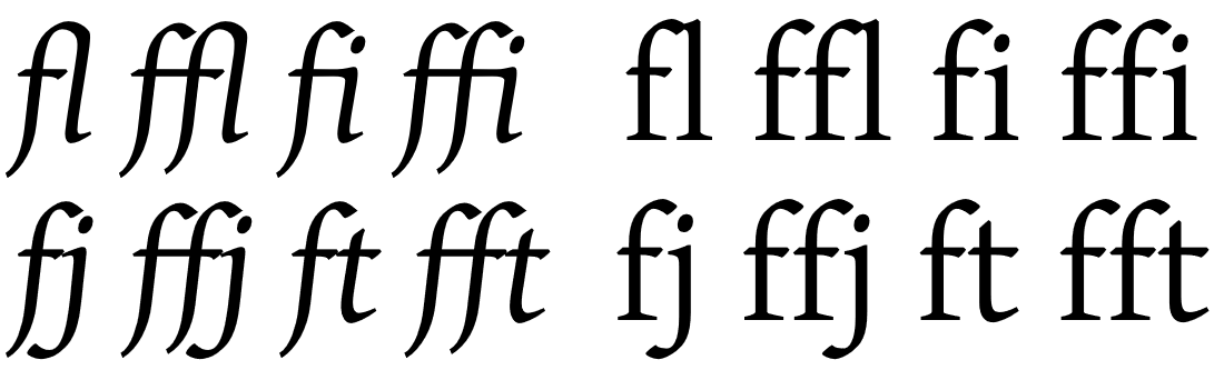
Issue 2:
Gentium plus could use a few more ligatures, particularly in the italic.
The italic has “fl” and “ffl” ligatures, and it looks like the roman could perhaps use them as well, to eliminate the current clash.
Additionally, the italic could also benefit from ligatures for “fj”, “ffj”, “ft”, and “fft”. These are unnecessary in the Roman, as the kerning already renders those sequences beautifully.
Thanks - I’ll add those to our list of requests, although I’m not likely to change the roman ones. It’s actually OK for the letters to touch. To create special ligatures would require deforming either the f or l and that would actually distract the reader’s attention rather than enhance their experience. It’s better to keep the flow consistent.
It may surprise you that there is actually very little kerning in Gentium Latin, and none for those combinations. I designed the font specifically to support a wide variety of OSes and apps - some of which did not support kerning at all. So I could not rely on kerning to make things look good. Gentium Greek, OTOH, has extensive kerning.
Those letter sequences fit together so nicely that it really is surprising that there is no kerning. But as I think about it, I realize that I’ve thought Gentium looked beautiful and “just so” since long before I had access to applications that implemented kerning.
I’ve been using (and loving) Gentium since late 2002 or early 2003 – almost as long as it’s been publicly available. In high school, as a first-year Latin student, I was searching for a serif typeface where the macrons felt native and natural, rather than looking like an ugly, blocky addition thoughtlessly pasted-on, and found that in Gentium. (The fact that the name was in Latin was a very nice bonus.) The macrons in the stock Microsoft typefaces are much less terrible now, though I think Gentium still does a better job with them than most.
As a chemistry student in high school and college, I also quite appreciated how capital I, lower-case l, and 1 were all easily distinguishable from each other. And as a life-long choral singer, I continue to appreciate how the IPA characters in Gentium look so natural.
To this day, Gentuim Plus Compact is my go-to serif typeface.
I love it so much that the English text on my ketubah (Jewish marriage document) is printed in Gentium Plus Compact Italic, as its balance of calligraphic and typographic sensibilities fit perfectly with the Hebrew scribal calligraphy typeface.
Thank you for designing such a beautiful and useful typeface. I very much look forward to the release of the bold weight and being able to stop using Gentium Basic for bold!
You’re very welcome. Thanks for the encouragement! I also took Latin and Chemistry, and occasionally direct a local choir.
1 Like