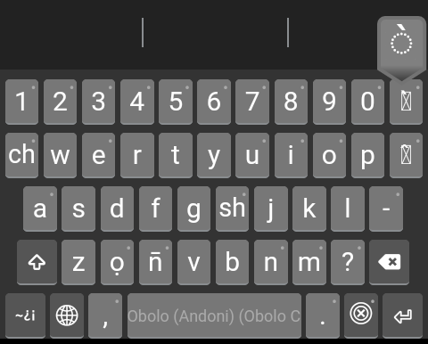
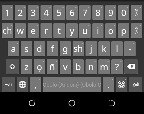
What should be done to make dotted circle with combining diacritics display correctly on the Keycap on mobile? It rather shows a box but will show the dotted circle on long press. (See attached image). I have seen some Keyman keyboards using dotted circles with combining marks. How is that done?
For display purposes, you can use the dotted circle character (U+25CC) together with the combining diacritics.
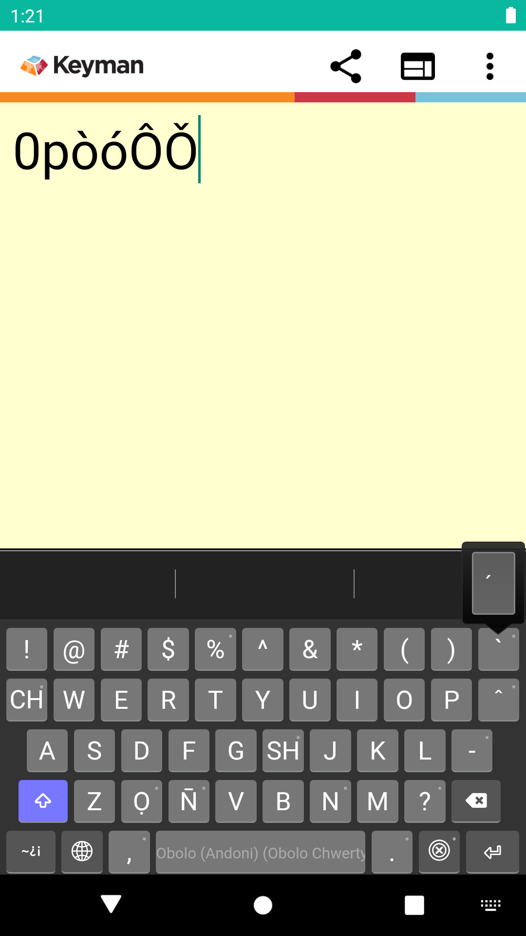
For the keyboard in question, it looks like your phone pick the default font to display. On my device, no dotted circle is shown. Here is what I see:
Unfortunately this is very font AND operating system dependent. Some fonts add the dotted circle, and some OSes add the dotted circle. If YOU add U+25CC you may end up with two dotted circles. It’s often difficult to know what is the best solution.
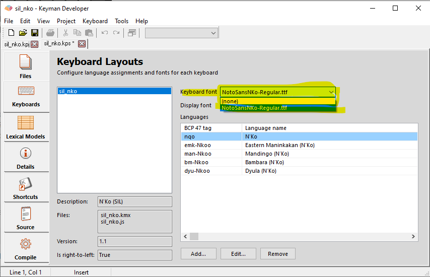
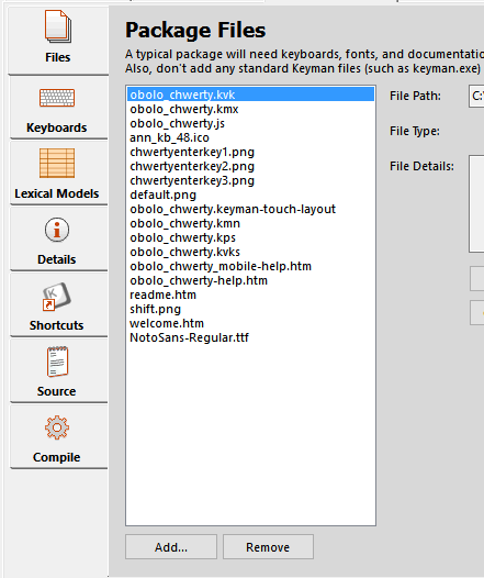
You can fix the square box issue by picking a font such as Doulos SIL in the Package Editor/Keyboards tab to include with your keyboard:
Some devices, particularly older ones, may not show the dotted circle, but most modern devices are more consistently showing it now.
1 Like
That’s exactly what I’ve done, which produced the image in the question.
The one you’ve downloaded is the current released version. I’m working on a new version, streamlining some things and adding a few other things, and I hope the dotted circle with combining diacritics will help reduce some questions from users such as “where is the a with [low tone].”
Instead of relying on the dotted circle, you can choose to use CSS to change the color of the diacritical marks so they look obvious on the screen.
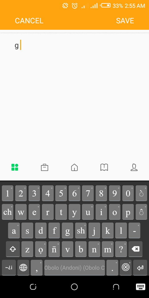
Thanks. Using DoulousSIL, as you suggested, solves the issue perfectly (see image).
But can you suggest a simpler/plain font that supports the dotted circle? I’m asking this for two reasons: 1) Apart from typing, the keyboard also aims to promote literacy in the language. So, as much as possible, what is tapped on the keyboard should be what appears to avoid confusion. 2) Staring at those fancy letters for long while typing long text especially on small screens, is not really good for the eye.
So, please point me to a simpler font, similar to the one in my original question or similar to the font used on Gboard. Thanks.
Marc said “the CSS may change in future versions of Keyman and impact the display of your keyboard.”
The color defined for key caps would not be impacted very much in the upcoming updates, if I remember correctly. Any heavy styles may be an issue. @Marc, kindly confirm if this is true.
Simpler fonts such as Andika or many from the range of Google Noto fonts (e.g. Noto Sans) would be appropriate.
Changing colors of the text or the background of the key will probably work okay in future versions; more complex CSS changes may be more difficult.
1 Like
It still shows the box with Google Noto Sans, but displays well with Andika.
I will still like to know if there’s any way to tell the Keyman app to display the tone keys in the particular fonts that support the dotted circle (e.g. Andika), and leave the rest of the keys in the default font.
For the current version of Keyman Developer, a font chosen for the layout will be applied globally.
Can you confirm that you have included and selected the Google Noto Sans in the package?
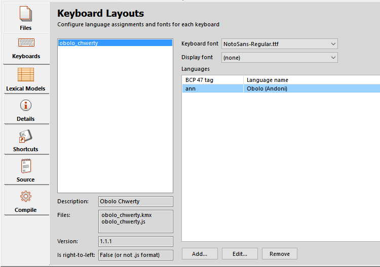
I think you still need to set the Display font to the NotoSans-Regular.ttf.
It shouldn’t be necessary to set the Display font as well; is it possible NotoSans-Regular.ttf does not support the combinations you wish to display?
If you are including the dotted circle character U+25CC, can you try leaving the dotted circle off the key cap and seeing how it displays?
I did. That only affected the appearance of text as you type in the Keyman text editor. It did not affect the Keycap.
It may be. It’s also possible that NotoSans does not have dotted circle (from what I’ve seen online).
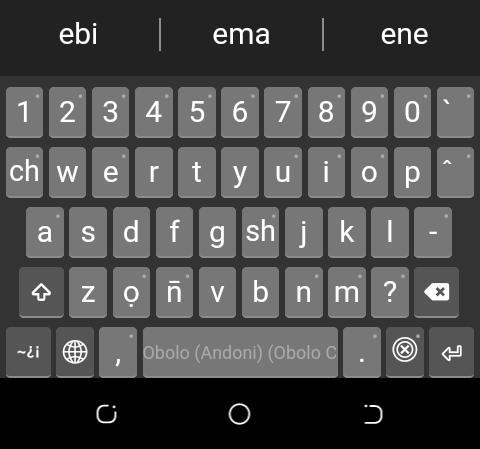
I just did it. The tone mark is pulled to the left of the button, as shown:
I’m wondering if this has anything to do with the way Keyman handles dotted circle. I’ve tried different fonts like Tahoma, Arial and Calibri. With Tahoma, the dotted circle shows well on the long press, but not on the keycap.
If there’s a way of specifying which font a particular key should use, then I would tell those tone keys to use Doulos SIL while the rest use Tahoma or NotoSans. If that’s not yet possible, then I will be contented to go with the style in the current released version until when a solution appears.
I just need a simple and plain keyboard layout, and one that people/new users can use easily without asking much question.
Thanks for all your replies.
At this point we don’t support multiple fonts. The rendering of the key caps in Keyman for Android is done by Chrome. There may be variations depending on the version of Chrome. The popups are currently rendered natively by the Keyman app (this may change in a future version).
On Keyman for iPhone and iPad, the key caps and the popups are currently rendered with Safari.
Today, in December 2023, I got stuck for half an hour on this detail. I was working in Keyman Developer, had changed a few minor details for fine-tuning. Then I needed of course to re-compile and then to re-package.
At this stage the packager had forgotten both my previous choices of Keyboard font and Display font. Since I had never touched the included font-file, it had not occurred to me to check those little pull-down-selectors.
Luckily my websearch brought me here and I was prompted to check my settings.
Question: Why would a packager forget details about X, Y and Z, when I only swap out one file ABC?
Proposal: If it has to do with how certain options are stored hierarchically under Y for example, and it cannot be avoided, then it would be nice user-guidance to color-mark or otherwise-mark all options that have to be re-set again. Because some packages are complex, and a user cannot guess what all needs doing, when he just tweaks one detail. Thank you for your consideration.