I’ve recently gotten some feedback on a Bible study app that swiping between the “chapters” wasn’t intuitive for the users. Each “book” (each separate studies) has 3 chapters: intro questions, a story, closing questions. Our initial attempt to make it as intuitive as possible was to put a right arrow at the bottom of the text, but that wasn’t obvious enough.
I see that there is the page selector:
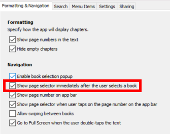
but that didn’t actually make a difference in my app, checked or unchecked. If it’s supposed to automatically activate the chapter dropdown, that too is a bit clunky and not significantly more intuitive than the swipe.
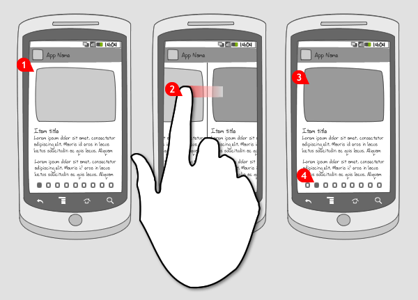
This is an example of how another app has done it:

So, navigation to other chapters could be indicated (1) by arrows at the bottom or (2) by a bar at the top (which would become crowded if there are more than just a few chapters).
If that part of the UI can’t be altered, another crazy thought was to have some kind of animation show up the first time a book is opened that would indicate that a swipe is possible. I don’t know if that would be a semi-transparent GIF layered over the text when it’s first opened or what. Just something like this:
that would indicate a swipe is optional.
Another wacky thought would be having an instructional GIF on the app’s splash screen - something quick that would either only play the first few times the app is opened or is simple and fun enough that it wouldn’t be annoying every time the app is opened. Currently, though, it seems like RAB will only take PNGs for a splash screen.
Does anyone have thoughts on this? Am I missing something obvious that’s already there?
