In beginning to work in the Book Boost project I am becoming aware of the need for good contrast in books/websites for the sake of people with low vision. The same issue could apply to the Bloom interface. In this screen shot, the parts boxed in red are ones where it seems like there could be better color contrast, which may mean choosing different colors for the field and/or text. I suppose we should probably also pay attention to color choice in relation to people with color blindness.
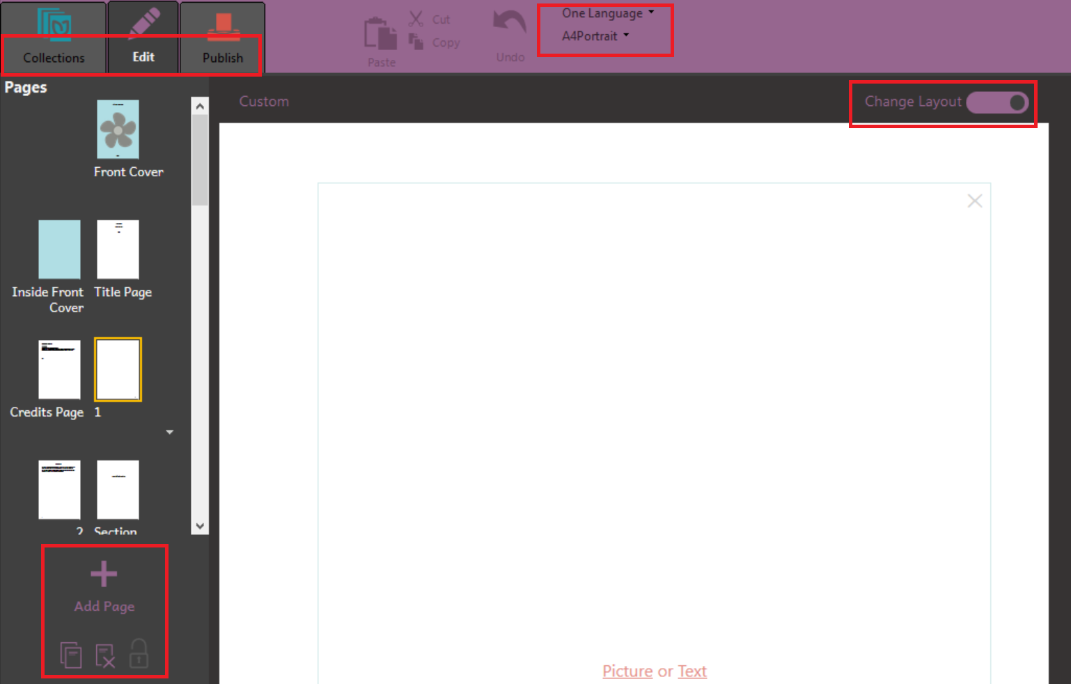
It doesn’t show up in the screen shot I posted, but the same issue arises for the very light print in the Change Layout mode for the pluses and dotted lines show where to split boxes and also with the very light print at the bottom right of text boxes giving the language of the text box. Those can sometimes be hard to make out for those of us with decent vision! I know they are light purposefully, but we may need to do something to make them more visible.
I agree with Paul, as I also have trouble picking up the contrast. it must be my old eyes…Kent
I’ve noticed that too.
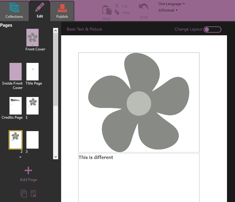
For Bloom 4.5, the greys have been darkened in order to increase the contrast, and tab labels are all white:
Based on the work done in Bloom 4.5, I’m going to close this so you can have your votes back if you’re satisfied with what we have now. If we want to have a dramatic “high contrast” mode, go ahead and make a new Feature Request for that. Thanks.